zetstuffed
Stuff u need
Superhero Movie Teaser Poster

In this tutorial I will give you an example of how to create a movie teaser poster. It will show you how to draw a mask for your character using the pen tool , blend modes and textures.
Also, I will be talking about usage of color for your environment, how to make your images sharper and I will give some tips on how to add more detail to your work.
Preview

Step 1
Start out with a dark canvas #080808 of 1600×2300 pixels (300dpi). I like to work on a high resolution so you keep your images sharper, more flexible and optimal for printing purposes if needed.
Step 2
To make the background a little more interesting and give it some “body” I used this free stained paper texture. Desaturate the texture, set your blending mode to hard light and pull the opacity down to 30%.

Step 3
Add the Nebula image in a new layer on top of the texture, flip it and use Hue Saturation (192, 26, 0). It should give a blue color as shown. Now use your mask tool to blend the image in the background. Only left, right and bottom should be masked (see image).

Step 4
Next up is adding the horizon image. Just like the steps before, desaturate the image and use soft light on your blending mode. I duplicated the image to make it show a little more detail. Use your gradient tool to mask the image from the top. We only need to see the mountain / rocks and a small piece of the sky.

Step 5
Pentool out the woman stock and place it on the nebula. Use a soft brush with 30% opacity to make the marked parts softer and blend them a little more into the background. The lower part of the woman has to be removed. I also used the smudge tool 30% strength) to retouch the face and arm.

Step 6
Use your pentool to draw the shape on the cheek of the woman. Colors used and layer styles are shown in the image. The only thing left to do is give the shape a soft light blending mode and a drop shadow on the top with an opacity of 25%. To make the shape blend more you can make a mask and use a soft brush on the left side of the shape.

Step 7
Let’s add some more detail. In a new layer use a soft white brush (20%) to make the space marked in the red circle a little lighter. This gives more depth and makes the shape more shiny. Also add a brush stroke with your pentool to the top of the shape.
Use the scratched metallic texture pack to add some scratches to the shape. Place the texture in the canvas, desaturate it and clip it on the shape as shown in the image. Set the opacity between 20-40%.

Step 8
Now we added the metallic scratch texture we are going to add extra detail to the shape. Make a selection of the computer chips stock and place it on the shape (opacity 85%, blending mode: soft light). Use your mask tool to mask it in the shape. I usually use a soft brush around the hard edges to blend it in. Finally, I also added two layers where I drew blue strokes and sparkles to give it more depth. To make the stroke on the top of the shape even more shiny you can add a white radial gradient.

Step 9
Make new layers and draw two shapes with your pentool as shown in the image. As we did before again use a soft white brush to highlight some parts of the shape. Only the top shape needs a drop shadow on the bottom. You can make a mask on your shape and brush out the hard edges of your pentooled shape. The next texture based steps are the same as used on the blue shape.

Step 10
If you followed the steps of texture usage and detail placement again, you we have a similar result as shown in the picture. To make the character more “superhero like” I added a glow to her eyes. Just use a radial gradient on top of the eyes (color: #10bdee) and set your opacity to 50% and layer style to screen.

Step 11
Create a folder called color adjustments and place it on the top of all your layers. That way it will effect all the layers below it.
Color fill:
color: #020317, set layer style to screen
Selective color:
Reds: +37, -10, -33. +30
Yellow: +25, 0, -15, 0
Neutrals: +5, 0, +2, +2
Blacks: +20, 0, 0, 0
Brightness / contrast:
Brightness: 11
Contrast: 7
Finally add a level layer. This really depends on how dark or light you want the image to be.

Step 12
Select the layer of the woman. Use your marque or lasso tool to make a selection of the part you want to make a cut from. Copy the selection and paste it in the exact same place. Use inner shadow and you get results as shown in the picture. For the arm part I did it a little different. I made a selection and filled it with color: #705e53. Then gave it an inner shadow.

Step 13
For the arm part you can use the steps I explained for the head shapes. Only thing added here is the placement of an electric symbol. Draw this with your pentool and fill it with color: #FFFFC1. You can make it fall in the shape with a subtle inner shadow.

Step 14
The rest of this tutorial is really up to your imagination. For this piece, I added helicopters and used dazzling lightings vector set for example. Just let your creativity run free and add anything you like to the piece until you are satisfied with your result.

Step 15
To finish it up add the the text. I used lightning beams covering the text. To do this, just copy a beam on the canvas, put it on top of the text and set blending mode to overlay. I used a soft brush to mask bits of the text. The font I used it called “The Sans”.
To finalize the image and make it more crisp I used smart sharpen (filter -> sharpen). Set it to about 30%. Don’t overdue it.

Finished
Photo Manipulate a Magical Shoe House Scene
Photo Manipulate a Magical Shoe House Scene
Resources Used In This Tutorial
Final Image
Here is a preview of the image that we are going to be creating:

Step 1
Create a new document (900X900px).
Open the ‘cloudy sky’ photo in the resources section for this tutorial.
Paste the sky into the top part of your canvas. I used the transform scaling box to make the height of this sky a little taller, filling more of the canvas:

Apply a color balance adjustment layer, being sure to give you adjustment layer a clipping mask. (Apply a clipping mask to all adjustment layers unless otherwise specified).
Color Balance Adjustment Layer Settings:
Highlights: -21 / +4 / -6
Midtones: -39 / +16 / -18
Shadows: -21 / +15 / +5


Step 2
Open the ‘grassy field’ image from the resources section for this tutorial.
Paste the image into your original document and position it at the bottom part of your canvas:

Apply a layer mask and use a soft, black paintbrush to mask off the top of your grassy field image. The idea is to let it look as if the underlying sky image is the actual sky for this scene.
Be sure to keep the sign post area in tact and don’t mask this off:

Apply a levels and color balance adjustment layer to your green field layer:
Levels Adjustment Layer Settings:
19 / 1.00 / 236
Color Balance Adjustment Layer Settings:
Highlights: -16 / -8 / -26
Midtones: -22 / +4 / -4
Shadows: -4 / +26 / -25


Step 3
Open up the ‘old boots’ image from the resources section for this tutorial. Cut out one of the boots using your preferred selection method and paste it into your original document, positioning it like this:

We want to get rid of the large lace hanging down the side of the boot. You’ll also notice a small light patch on the bottom left of the soul. This was the second boot in the original image, and we want to get rid of this area too.
Use the clone stamp tool to clone over these areas. Start by option+clicking on your boot layer to select it. The marching ants active selection around your boot will mean that non of your cloning efforts will go outside the edges of your boot shape.
Then proceed to use your clone stamp tool like normal to clone out areas of your boot:

You can see the result of the cloning process below. I also applied a layer mask and masked off the top of the boot using a large, soft black paintbrush (you’ll see why later in the tutorial):

Apply a levels and color balance adjustment layer to your boot layer:
Levels Adjustment Layer Settings:
9 / 0.95 / 244
Color Balance Adjustment Layer Settings:
Highlights: -5 / +6 / +2
Midtones: +16 / +11 / +16
Shadows: -11 / +1 / -9


Step 4
Create a new layer underneath your boot layer called ‘shadow under boot’.
Use a medium sized, soft black paintbrush (around 20% opacity) to build up a shadow between your boot and the ground:

Create a new layer ABOVE your boot layers and call this ‘shadow bottom of boot’.
Apply a further shadow underneath your bottom area, but this time overlap the bottom of your boot slightly, blending the boot into the shadowed area:

Step 5
Open up the ‘door’ image from the resources section for this tutorial. Select the door using your preferred selection method and then paste it into your original document.

Go to edit>transform>distort and distort your door so that it fits better with the edge of your boot:

Apply a levels, hue/saturation and color balance adjustment layer to your boot layer:
Levels Adjustment Layer Settings:
23 / 0.93 / 241
Hue/Saturation Adjustment Layer Settings:
0 / -20 / 0
Color Balance Adjustment Layer Settings:
Highlights: -56 / -29 / -11
Midtones: -30 / -9 / +12
Shadows: -32 / -6 / +5


Step 6
Right now our door is looking a little flat and not really part of our boot’s structure.
To fix this, create a new document called ‘shadow over door’.
Use a soft, black paintbrush to paint around the edges of your door, creating the effect than the door is concave into the structure of your boot:

Download the ‘bell photo’ image from the resources section for this tutorial.
Cut it out from it’s background and paste it into your original document.
Position and resize the bell to fit next to your doorway. The colors are already pretty well blended with your surrounding composition, so no adjustments needed just yet:

Step 7
Open up your ‘roof’ image from the resources section for this tutorial.
Extract the roof part of the image from it’s background and paste this into your original document.
The roof is roughly at the right angle, so just use your basic transform tools to manipulate it very slightly to fit the top of your boot better:

Apply a levels and color balance adjustment layer to your roof layer:
Levels Adjustment Layer Settings:
22 / 0.81 / 247
Color Balance Adjustment Layer Settings:
Highlights: +12 / +2 / -2
Midtones: -25 / +6 / -1
Shadows: +12 / -6 / -8


Step 8
Create a new layer called ‘shadow over roof area’. Use a soft black paintbrush to shadow the bottom part of your roof and the top part of your boot. This should help blend them better together.

Step 9
Open up the ‘wooden beams’ image from the resources section for this tutorial.
Select one of the beams using your preferred selection method and copy/paste it back into your original document.
The colors of the beam are pretty well blended already with the rest of our composition, so no adjustments are needed for now.

Duplicate the beam several times. Resize and transform each beam to fit as a support for your roof structure:

Add a further beam to sit horizontally underneath your roof.
Then create a new layer called ‘shadows blending beams’. Use a soft black paintbrush to add shadows to the top of your beams, blending them better with your roof area.
Finally, apply a layer mask to each of your beam layers. Use a soft black paintbrush to mask off the bottom of each beam, blending it into the leather of your boot:

Step 10
Create a new layer beneath your beams called ‘beam shadows’.
Use your lasso tool and paintbucket tool to create some rough black shadows where you anticipate the shadows cast by your beams to go:

Reduce this layer’s opacity to around 55%, and then go to filters>convert for smart filters. This will allow you to apply filters not destructively. Now go to filters>blur>gaussian blur.
Apply a 3.5 pixels strength gaussian blur:

Step 11
Open up the big ben clock image from the resources section for this tutorial.
Extract the clock part of the tower, and the square frame surrounding it. Paste this into your original document:

You’ll notice that the clock isn’t the right angle to fit with our rooftop right now. This is a pretty easy fix. Simply go to edit>transform>distort and distort your clock until it looks like the image below:

Apply a color balance adjustment layer to your clock layer:
Color Balance Adjustment Layer Settings:
Highlights: +11 / +4 / -11
Midtones: +25 / +6 / -16
Shadows: +6 / 0 / -18

I also created a new layer called ‘shadow clock’ and used a soft, low opacity black paintbrush to add some additional shadow around my clock:

Step 12
Time to add a chimney to our roof!
Start by opening the ‘chimney’ image in the resources section for this tutorial.
Extract the chimney and paste it back into your original document.
Position the chimney over your roof, and use a layer mask to mask the bottom of the chimney smoothly into your roof area (using a soft black paintbrush for this):

Apply a levels and color balance adjustment layer to your chimney layer:
Levels Adjustment Layer Settings:
20 / 0.79 / 240
Color Balance Adjustment Layer Settings:
Highlights: +16 / +11 / -9
Midtones: -13 / -6 / -9
Shadows: +4 / 0 / -8


Step 13
Download the ‘FanExtra premium brush set: Clouds’ brush set from the resources section for this tutorial.
Create a new layer called ‘smoke’.
Select one of your cloud brushes and use a white paintbrush to give the impression of smoke rising up from the chimney of the house:

To make the effect slightly more subtle apply a layer mask and use a low opacity, soft black paintbrush to mask off areas of your smoke:

Step 14
Now paste in your ‘window’ image from the resources for this tutorial.
Apply a layer mask and use a soft black paintbrush to mask off the area around your window, blending it more smoothly into your boot’s surface:

Apply a color balance adjustment layer to help blend the colors of the window better:
Color Balance Adjustment Layer Settings:
Highlights: +2 / -4 / -2
Midtones: +29 / +12 / -4
Shadows: +21 / +9 / -15

Step 15
Add some additional lighting and shadowing to your window.
Use a soft, low opacity black paintbrush to paint in shadows around the left edge of your window.
Then use a soft, low opacity yellow/orange brush to give a subtle tint of light coming out of the window:

Step 16
Cut out and paste in your doormat image from the resources section for this tutorial.
You will need to go to edit>transform>distort to distort the mat to fit nicely in front of your door:

Apply a levels, hue/saturation and color balance adjustment layer (in that order).
Levels Adjustment Layer Settings
23 / 0.89 / 224
Hue/Saturation Adjustment Layer Settings:
Hue: 0
Saturation: -55
Lightness: -25
Color Balance Adjustment Layer Settings:
Highlights: +1 / +4 / -9
Midtones: -2 / -4 / -11
Shadows: -5 / +1 / -6


Step 17
To help blend your doormat better, create a new layer called ‘shadow doormat’.
Use a soft black paintbrush to paint in shadows between the doormat and the door, as well as underneath and to the sides of the mat a little.

Download the free grass brush set from the resources section for this tutorial.
Create a new layer called ‘grass’. Use your eyedropper tool to sample a shade of green from the surrounding grassy area. Use several of your grass brushes to create areas of grass that overlap your welcome mat.

Step 18
Copy/paste in the image of the girl sitting from the resources section for this tutorial. Position her so she is sitting on the end of the boot:

Adjust the colors of the girl very very slightly just to fit better with the surrounding composition.
Then create a new layer called ‘shadow under girl sitting’.
Use a soft, mid-opacity black paintbrush to brush a shadow under the girl and slightly covering her right side. This makes it look more realistic that she is actually sitting on top of the boot:

Step 19
Paste in the ‘running children’ image from the resources section for this tutorial:

Apply a color balance adjustment layer. You should aim to make the grass in your ‘running children’ image match the lightest grass in your main composition.
Color Balance Adjustment Layer Settings:
Highlights: +8 / +35 / -16
Midtones: +13 / +40 / -23
Shadows: +9 / +13 / -26


You’ll notice that whilst your color balance adjustment layer has turned your grass a nice color, it’s also made your children green. To fix this, simply mask off this area of your adjustment layer, just like you would a normal mask. Simply select the mask attached to your adjustment layer and use a black paintbrush to paint over your children, thus returning them to their original, non-adjusted color:

Now select your ‘running children’ layer and mask off the edges of the image until you’re left with just your children and a little blending grass surrounding them:

Step 20
Copy the ‘red balloon’ image from the resources section for this tutorial into your original document.

Option+click on this balloon layer to select your balloon shape. With your selection active create a new layer called ‘balloon shadow’. Use a soft, low opacity black paintbrush to paint a shadow on the left/bottom side of your balloon, making it more rounded:

Create a new layer called ‘string’.
Select your paintbrush tool, and select a 1px, white paintbrush at 55% opacity. Use your path tool to create a wavy path dangling down from your balloon. In your paths palette right click on your path and click ‘stroke path’, selecting ‘paintbrush’ as the stroking option.
This should stroke your path line with a 55% opacity 1px white line. This is an easy way to create a simple balloon string:

Step 21
Time to start adding some final lighting and adjustments to our piece.
Create a new layer called ‘blue lighting’. You want to give the impression of some of the blue of our sky bleeding across into the boot/grassy areas. This should give the impression of various light sources in the piece effecting one another.
Use a large, soft paintbrush tool (69cbe1) to create a series of soft blue spots along the edges of your boot and grass:

Reduce this layer’s opacity to 10% to make the effect more subtle:

Repeat the same steps on a new layer called ‘green lighting’. This time paint green (456300) light spots along the bottom of your shoe, as if the green from your grass is casting this color upwards:

To make the effect more subtle change this layer’s blend mode to ‘overlay’ and reduce it’s opacity to 20%:

Step 22
If you check out the image below you’ll see that our sign post is a strange color. This is caused by the original adjustments on our ‘grassy field’ layer.

To fix this we could always mask off that area of our original color balance adjustment layer. However, we want even more control over our sign color than that!
Create a new hue/saturation adjustment layer (DO NOT APPLY A CLIPPING MASK TO THIS ADJUSTMENT LAYER).
Apply the settings shown below:
Hue Saturation Adjustment Layer Settings:
Hue: 0
Saturation: -55
Lightness: +10
This will cause your sign to become a nicer color, but will also reduce the saturation of the rest of your image, which you don’t want!
To fix this, select the mask associated with this adjustment layer. Fill your entire canvas with black (thus masking off your entire adjustment layer). Then go in with a white paintbrush and paint over your sign area.
This will reveal your hue/saturation adjustments, but only in this specific area, as your reveal your adjustment layer’s mask.
And there you have it, safe, non-destructive blending, with plenty of control!

Step 23
To give a slightly more fantasy look to our piece we’re going to apply a dodge/burn layer.
Create a new layer called ‘dodge/burn’. Change this layer’s blend mode to ‘overlay’.
Then use a soft, low opacity black paintbrush to burn your image, and a soft, low opacity white paintbrush to dodge it. You should aim to create a more unified light source, accentuate shadows/highlights where appropriate and just generally bring the feel of your piece together more:

Step 24
As a final adjustment apply a gradient overlay adjustment layer (DO NOT APPLY A CLIPPING MASK TO THIS ADJUSTMENT LAYER).
Select the default gradient overlay ‘orange, yellow, orange’.
Reduce this layer’s opacity to 2%.

And We’re Done!
You can view the final outcome below. I hope that you enjoyed this tutorial and would love to hear your feedback on the techniques and outcome.
Using Custom Photoshop Brushes to Create an Immersive Lighting Effect

In this this tutorial I’m going to walk you through a few steps on how to use custom Photoshop brushes along with a few vector elements to create this immersive lighting effect composition. You’ll be surprised at how easy the steps are to create this piece.
First off, here’s a look at what we’ll be creating.

Here is a list of the WeGraphics elements that I used for this piece.
Painted Light Effects Brushes
Grunge and Retro Mountains
For those non-WeGraphics Members, I’d like to suggest these free resources as an alternative.
Psionic Storm Brush Set
Grunge Stone Wall Texture
Step 1
Lets start by grabbing the stock photo of the boy jumping. You can download it here. Now use you favorite selection method to pull the boy from the background. I used a combination of the Quick Selection Tool ![]() to make the initial selection, and Quick Mask Mode to clean up the edges.
to make the initial selection, and Quick Mask Mode to clean up the edges.
Now copy and paste the boy onto a new black canvas 725 x 990 pixels.

Step 2
For the next step lets go ahead and create the background. I pulled a texture from the Grunge and Retro Mountains set. I sized it down and placed it on a layer behind the boy. I set the layer’s blend mode to Overlay.
Then on a layer below the texture I used a large soft gray brush to paint some of the texture behind the boy.

Step 3
Next lets desaturate the boy (Image | Adjust | Desaturate). Then make a few random selections, and cut and paste them to offset sections of the boy’s legs. To tilt your selections at an angle use (Select | Transform Selection).

Now combine (Cmd + E) the layers containing sections of his legs with his original layer. Then duplicate the layer and set that layers blend mode to “Overlay”. That should punch the contrast on the boy a little.

Step 4
In this next step I’ve simply applied a few brushes from the Painted Light Effect Brush Set each to its own layer with a blend mode set to Overlay. Below is the progression of brushes being applied.


Step 5
To create the ribbons wrapping around the boy, we need to head over to Adobe Illustrator for this next step. In Illustrator create a new canvas with some random rectangles in an orange/gold color. You’ll have to experiment a little in order to get the variety and pattern correct for these ribbons. Adjusting this initial layout is how to accomplish that.

Select all of the rectangles and drag them over to the symbols palette. This new dialog will appear. You can name the symbol, if you like, and you can ignore the rest. Press Okay to add the symbol to the palette.

You can delete the group of shapes after adding them to the symbols palette.
Now create a simple line drawing with the pen tool similar to what I have below.

Now select (Effect | 3D | Revolve). Inside the dialog choose “Front” for the position, and check “Preview”.

Now click “Map Art”. You’ll need to make several selections in this dialog. First choose the number 5 for the Surface (this may require a little experimentation, so choose a different surface if number 5 doesn’t work right for you). Choose your newly created symbol in the symbol drop down box.

Now choose “Scale to Fit”, and check “Shade Artwork” and “Invisible Geometry”. Click Okay. You should now have something like this.

Again, you may need to experiment with the size and number of rectangles for your initial symbol, until you get something you are happy with to wrap around the boy back in Photoshop. Once you have something you like, move on to the next step.
Step 6
Copy and paste your ribbons onto your Photoshop document. I ended up with 3 different ribbon layers, and I placed them in between some of the light layers. Experiment with different arrangement to see what you like the best.
I erased portions of the ribbons so that it appears that they are wrapping around the boy. I also used the dodge and burn tools to create subtle shadows around the ribbons where they overlap.

Step 7
For the final step, I copied the mountain texture layer onto a new layer above all others and set that layer’s blend mode to Overlay.

Then I created a Gradient Map Adjustment Layer and placed it above all others. I used a dull olive color for the gradient.

Below is my final image. I hope this tutorial help to illustrate how easy it is to use custom brushes to create a stunning effect in a very short amount of time. I’d love to see your results, feel free to share them using the comment fields below.
Create an Easy Dispersion Effect in Photoshop

Giving a subject a dispersion or splatter effect can create an incredibly dynamic image. The best part is, it’s very quick and easy to do with a few Photoshop brushes, but the end result can look very complex as if it took you hours to create. In this tutorial, I’m going to walk you through 3 easy steps to create this dispersion effect.
Here’s a look at what we’ll be creating.

WeGraphics members will want to grab this brush set for the tutorial:
For non-WeGraphics members a good free alternative can be found here:
Step 1
After a little bit of searching I found this photo of a guy jumping in the air by Camera Eye Photography. This is a great photo for this effect because the subject is in motion. So our dispersion effect will help to enhance that motion.
Copy and paste the photo into a new PS document. I sized mine down to 2500px wide. Using the Quick Selection Tool (W), I made a selection of the guy and copied and pasted him to a new layer. I then loaded the selection again, and with the background layer selected, I chose (Edit | Fill | Content Aware).

Content Aware did a pretty good job of removing the guy from the background. There is still a silhouette visible, but that’s okay, we’ll be covering most of it up. We just want some of the background color to show through. If you’re extra picky, you can remove the silhouette with the Clone Stamp Tool (S).
Step 2
Lets go ahead and duplicate the guy layer one time. So you should have two layers that have our guy jumping. Select the bottom most guy layer and press (Cmd+T) to transform him. You want to stretch the guy horizontally.

I roughly selected his arm and leg and moved them back to the edge of the non-distorted guy in the layer above. The idea here is that we’re giving a color area for our splatters to pick up via a mask.
Lets go ahead and create that mask for the distorted guy layer. Select the distorted guy layer and click the layer mask icon at the bottom of the layers palette. Fill the mask with solid black.

Now use the splatter brushes to reveal portions of the layer by clicking the mask using solid white as the foreground color.
For the top non-distorted guy layer, we also want to create a layer mask. But this time we want to leave it solid white, and use a black splatter brush to remove portions of the guy to reveal some of the background.

Pretty easy, huh?
Step 3
For the final touches lets add a bit of vignette and highlight. But before we do that… I took one large dark splatter and placed it on a layer behind the guy. I basically just wanted to see some light splatters that fell beyond the distorted guy’s layer mask.

For the vignette, lets switch over to Quick Mask Mode (Q), and choose a very large soft black brush and click once in the center of the image.

Switching out of QMM you’ll see that we have a selection that excludes the very center of the image. The selection is also nicely feathered due to our soft black brush.

Now create a new Levels Adjustment Layer above all other layers, and adjust as follows.

For the final touch, lets add a highlight. Create a new layer above the guy layer, and set its blending mode to Opacity. Now with a soft white brush make 1 or two clicks over the guys head and torso. You may need to reduce the opacity of this layer down to 50% or 60% depending on how hot the highlight appears.

I hope this quick tutorial has inspired some ideas on how to use PS brushes to create interesting dispersion effects in your artwork. Experiment and have fun!
The Bourne Legacy Movie Poster Photoshop Tutorial
Preview of Final Results

The Bourne Legacy Movie Poster Photoshop Tutorial
Tutorial Resources
Step 1
Start by opening the photo into Photoshop. To open an image, go to File > Open. If you’ll be using the same image we used, we recommend downloading the highest resolution image because we will be cropping it in the middle of the tutorial.

Step 2
Right-click on the layer then click Convert to Smart Object. This will convert the layer into a Smart Object which lets us manipulate the image non-destructively.

Step 3
Before we start, we’re going to add a black layer below the photo layer. To do this, go to Layer > New Fill Layer > Solid Color. Select black as the color then click OK.

Step 4
In the Layers palette (Window > Layers), drag the Color Fill layer to the bottom. Rename the top layer to Photo and bottom layer to Background. To rename a layer, double-click on the text of the layer you want to rename.

Step 5
To begin, we’ll add a gritty photo effect with adjustment layers and filters. Start by adding a Black & White adjustment layer (Layer > New Adjustment Layer > Black & White) then change the blending mode of this layer to Overlay. Feel free to play around with the settings in the Properties panel (Window > Properties). This is an easy way of adding a grungy lighting effect and you can try it with your other photos. 
Step 6
Next, add a Vibrance adjustment layer (Layer > New Adjustment Layer > Vibrance). Reduce vibrance setting until it just has a hint of color.

Here’s what our image looks like after reducing the vibrance setting. 
Step 7
The adjustment layers gave it a grungy lighting effect but it also hides the detail and makes the background even darker. We don’t want to the photo to be too dark because it can blend in with the black background and make the stripes not very visible. To fix this, we’re going to apply a Shadows/Highlights adjustment. In the Layers panel, select the Photo layer then go to Image > Adjustments > Shadows/Highlights. Set the shadows to around 35% and highlights to around 15% then click OK.

If you look in the Layers palette, you can see that the adjustment was applied as a Smart Filter. This is because in Step 2, we changed the layer into a Smart Object. The benefit of using Smart Filtersis that you can change the settings at any time without undoing a bunch of steps.

Step 8
Next, we’re going to add some grain to the photo using the Add Noise filter – which will be applied as a Smart Filter just like the previous step. Make sure you have the Photo layer selected then go to Filter > Noise > Add Noise. Checkmark the Monochromatic option then adjust the settings so that you get an effect like shown in the image below. Click OK to add the noise.

Step 9
Next, we’re going to crop and rotate the image. Select the Crop tool (C) then in the options bar, disable the “Delete Cropped Pixel” option. This will let us uncrop or make adjustments to the crop at any time.  Crop the image like shown in the image below. We also rotated the image so that the eyes are more horizontally aligned. This is important because when we add the stripes, we want to ensure that the eyes are visible and don’t tilt off the top or bottom edge of the stripes.

Step 10
Now we’re going to add some text to the image. We’re doing this first so that we know where to place the stripes later. In the Layers palette, select the top layer so that when you add the text, they all appear above the top layer. Select the Text tool then add some text around the image with each line of text in their own layer. The font used below is Arial.

Step 11
Select all the text layers (hold CTRL to select multiple layers) then add them to a group (Layer > Group Layers or Ctrl+G). Rename the group to Text.

Step 12
Group the layers associated with the Photo layer (Vibrance, Black & White, & Photo) then rename the group to Photo. 
Step 13
Now we’re going to add the stripes. This is really easy to do and the only tool needed is the Rectangular Marquee tool. Select the Rectangular Marquee tool then in the options bar, set the mode to “Add to Selection” which is the second button to the left. You can hover over the icons to see what each one does. Also, ensure that your feather setting is set to 0px. ![]() Draw some rectangles like shown in the image below. Start by drawing rectangles around the text and eyes then adding more afterwards. If you make a mistake, just press Ctrl+Z to undo. Want to start over? Press Ctrl+D to deselect and start over.
Draw some rectangles like shown in the image below. Start by drawing rectangles around the text and eyes then adding more afterwards. If you make a mistake, just press Ctrl+Z to undo. Want to start over? Press Ctrl+D to deselect and start over.

Step 14
In the Layers palette, select the Photo group then click on the Add Layers Mask button. This will create a layer mask from the selectionyou made in the previous step.

Here’s what our image looks like so far.

Step 15
We’re almost done! Select the Rectangular Marquee tool and create selections around the text. Make sure your foreground/background colors are set to the default white/black by pressing D to reset the colors. Press Delete to fill the selected area with black. Press Ctrl+D to deselect.

When you’re done, set the mode back to New Selectionso that you don’t get confused the next time you use the Marquee tool.
![]()
Step 16
In the Layers panel, click on the layer mask of the Photo group – make sure you’re clicking on the thumbnail so that you are editing the layer mask.  Press D on your keyboard to reset your foreground and background colors then press delete on your keyboard. This will fill the selected area with black. Press Ctrl+D to deselect the selectionwhen you’re done. Here’s what our image looks like.

Step 17
Remember earlier when we talked about Smart Filters? Here’s an example of a situation where you will find them useful. The photo of the background seems too strong and we need to make changes to the Shadows/Highlights adjustment. To do this, just double-click on the Shadows/Highlights adjustment in the Photos layer. Without Smart Filters, you would have had to undo many steps to do this.

I reduced the shadows and increased the highlights for a more realistic look. Click OK after you’ve adjusted your settings.

Step 18
To finish the image, we’re going to add a slight gradient to the text. Right-click on any one of the text layers then choose Blending Options.

Checkmark the Gradient Overlay style then set the settings shown below. The Dither option reduces banding in the gradient by dithering and should always be enabled. Click OK when done.

Final Results
Eiffel Tower Photoshop Tutorial
Preview of Final Results

Eiffel Tower Photoshop Tutorial
Tutorial Resources
- cloud – le-scud
- Skeleton Key – nighty-stock
- desert sunset – night-fate-stock
- Eiffel tower stock – crazykitty82stock
- balloons – charlie-stock
- Playtime XXIII – Wonderdyke-Stock
- Piano I – sun-stock
Step 1: Create a New Image File
Create a new 3500×3500 pixels document at 300 pixels/inch. The background contents should be white.

Step 2: Create the Background
First off, let’s open the cloud in Photoshop. We will be using sky from this stock image so we will need to transfer it to our main canvas. Click the cloud and press V to activate move tool and Left-click the image and drag the image to the main canvas and change layer name to “sky”.

The result should be similar to this:

Next, activate the Transform tool (Ctrl/Cmd +T), then while the “Sky” layer is selected and then resize it as shown below:

The result should be similar to this:

First off, let’s open desert sunset in Photoshop. We will be using the sky from this stock image so we will need to transfer it to our main canvas.

Click the Wots up world and press M to Rectangular marquee tool and then make a selection around the sky and then click V to activate the Move Tool. Left-click the image and drag the image to the main canvas and change layer name to “Sky 2″.

The result should be similar to this:

Now activate a Mask tool for Sky2 from the bottom of layers palette.

Now activate Brush tool (B) with these settings :
- Brush size: 400px
- Hardness: 0%
- Opacity: 40%
- Flow: 100%
- Color: #000000

Now paint over the highlighted area.

The result should be similar to this:

Now go back to “Sky 1″ layer and then create a Color Balance adjustment layer which can be found by pressing on the Create New Fill/Adjustment layer button shown on the layer window:

When the Color Balance box opens, input the following:

The result should be similar to this:

Now go back to “Sky 2″ layer and then create a Color Balance adjustment layer which can be found by pressing on the Create New Fill/Adjustment layer button shown on the layer window:

When the Color Balance box opens, input the following:

Press Alt+left click in between 2 layer’s (Sky 2 layer and Color Balance) to make a mask.

The result should be similar to this:

Now create new Curves adjustment layer from the bottom of layers palette .Press Alt+left click in between 2 layer’s (Sky 2 layer and Curves) to make a mask.

When the Curves box opens, input the following:

The result should be similar to this:

tep 3: Fix Tower
First off, let’s Eiffel tower stock in Photoshop. We will be using the tower from this stock image so we will need to transfer it to our main canvas.

Click the Eiffel tower stock and press P to activate pen tool and then make a selection around the tower and then click V to activate the Move Tool. Left-click the image and drag the image to the main canvas and change layer name to “tower”.

The result should be similar to this:

Next, activate the Transform tool (Ctrl/Cmd +T), then while the “Tower” layer is selected and then resize it as shown below:

The result should be similar to this:

Activate brush tool then right click on the canvas while the Brush tool (B) is active and then pick this brush:

Now paint over the highlighted area.

The result should be similar to this:

Move Tower to the other place .

The result should be similar to this:

Activate brush tool then right click on the canvas while the Brush tool (B) is active and then pick this brush:

Now paint over the highlighted area.

The result should be similar to this:

Now create new Brightness/Contrast adjustment layer from the bottom of layers palette .

When the Color Balance box opens, input the following:

Press Alt+left click in between 2 layer’s (Tower layer and Brightness/Contrast) to make a mask.

The result should be similar to this:

Now create new Curves adjustment layer from the bottom of layers palette .Press Alt+left click in between 2 layer’s (Tower layer and Curves) to make a mask.

When the Curves box opens, input the following:

The result should be similar to this:

Step 4: Create Source Light
Now activate a new layer name it “Source light” and fill it with black color (#00000).

Now go to Filter > Render > Lens Flare :

When the Lens Flare box opens, input the following:

The result should be similar to this:

Now Change the layer mode to Liner Dodge.

The result should be similar to this:

Step 5: Fix girl in canvas
First off, let’s open Playtime XXIII stock in Photoshop. We will be using the girl from this stock image so we will need to transfer it to our main canvas.

Click the Playtime XXIII and press P to activate pen tool and then make a selection around the Girl and then click V to activate the Move Tool. Left-click the image and drag the image to the main canvas and change layer name to “Girl”.

The result should be similar to this:

Next, activate the Transform tool (Ctrl/Cmd +T), then while the “Girl” layer is selected and then resize it as shown below:

The result should be similar to this:

Now move it to here to there :

The result should be similar to this:

Reduce the Opacity of “girl” to 85% :

The result should be similar to this:

Step 6: Fix Piano
First off, let’s open the Piano I stock in Photoshop. We will be using the Piano from this stock image so we will need to transfer it to our main canvas.

Click the Piano I and press P to activate pen tool and then make a selection around the Piano and then click V to activate the Move Tool. Left-click the image and drag the image to the main canvas and change layer name to “Piano”.

The result should be similar to this:

Next, activate the Transform tool (Ctrl/Cmd +T), then while the “Piano” layer is selected and then resize it as shown below:

Once again, activate the Transform tool (Ctrl/Cmd +T), then while the “Piano” layer is selected and then resize it as shown below:

The result should be similar to this:

Reduce the opacity of “piano” layer to “90″.

The result should be similar to this:

Step 7: Fix Balloons
First off, let’s open the Balloons stock in Photoshop. We will be using the Balloons from this stock image so we will need to transfer it to our main canvas.
Click the Balloons stock and press P to activate pen tool and then make a selection around the Balloons and then click V to activate the Move Tool. Left-click the image and drag the image to the main canvas and change layer name to “Balloons”.

The result should be similar to this:

Next, activate the Transform tool (Ctrl/Cmd +T), then while the “Balloons” layer is selected and then resize it as shown below:

The result should be similar to this:

Now Open the Color piker and chose #464646 as foreground color.

Open Brush (B) chose Hard round brush as below :

Now a new layer and name it “Thread” then activate Pen tool and make a curve:

Now right click and chose Stock path from options.

When stock path box opens Select brush.

The result should be similar to this:

Right click and chose Delete path .

The result should be similar to this:

Make more threads following the same steps:

Step 8: Fix Key
First off, let’s open Skeleton Key stock in Photoshop. We will be using the key from this stock image so we will need to transfer it to our main canvas.

Click the Skeleton Key and press P to activate pen tool and then make a selection around the key and then click V to activate the Move Tool. Left-click the image and drag the image to the main canvas and change layer name to “Key”.

The result should be similar to this:

Next, activate the Transform tool (Ctrl/Cmd +T), then while the “Key” layer is selected and then resize it as shown below:

The result should be similar to this:

Now activate Erase tool (E) with these settings Now let’s erase :
- Brush size: 400px
- Hardness: 0%
- Opacity: 40%
- Flow: 100%
- Color: #000000
Now paint over the highlighted area.

The result should be similar to this:

Duplicate the “Key” layer (ctrl+j) and rename it “key2″ see as below .

Step 7: Fix Balloons
First off, let’s open the Balloons stock in Photoshop. We will be using the Balloons from this stock image so we will need to transfer it to our main canvas.
Click the Balloons stock and press P to activate pen tool and then make a selection around the Balloons and then click V to activate the Move Tool. Left-click the image and drag the image to the main canvas and change layer name to “Balloons”.
The result should be similar to this:
Next, activate the Transform tool (Ctrl/Cmd +T), then while the “Balloons” layer is selected and then resize it as shown below:
The result should be similar to this:
Now Open the Color piker and chose #464646 as foreground color.
Open Brush (B) chose Hard round brush as below :
Now a new layer and name it “Thread” then activate Pen tool and make a curve:
Now right click and chose Stock path from options.
When stock path box opens Select brush.
The result should be similar to this:
Right click and chose Delete path .
The result should be similar to this:
Make more threads following the same steps:
Step 8: Fix Key
First off, let’s open Skeleton Key stock in Photoshop. We will be using the key from this stock image so we will need to transfer it to our main canvas.
Click the Skeleton Key and press P to activate pen tool and then make a selection around the key and then click V to activate the Move Tool. Left-click the image and drag the image to the main canvas and change layer name to “Key”.
The result should be similar to this:
Next, activate the Transform tool (Ctrl/Cmd +T), then while the “Key” layer is selected and then resize it as shown below:
The result should be similar to this:
Now activate Erase tool (E) with these settings Now let’s erase :
- Brush size: 400px
- Hardness: 0%
- Opacity: 40%
- Flow: 100%
- Color: #000000
Now paint over the highlighted area.
The result should be similar to this:
Duplicate the “Key” layer (ctrl+j) and rename it “key2″ see as below .
Step 9: Create Shadow’s
Now activate a new layer and name it “Shadow”. Activate Brush tool (B) with these settings:
- Brush size: 400px
- Hardness: 0%
- Opacity: 40%
- Flow: 100%
- Color: #000000
Now paint over the highlighted area.

The result should be similar to this:

Step 10: Enhance the Light and Color of the overall image
Now create a Solid color adjustment layer which can be found by pressing on the Create New Fill/Adjustment layer button shown on the layer window:

When the Solid color box opens, input the following:

The result should be similar to this:

Change the layer mode to “Exclusion” and reduce the opacity to 20% :

The result should be similar to this:

Step 11: Create a Vignette
Activate new layer and name it “Vignette” and fill it with white color (#ffffff).

Now go to Filter > Distort > Lens Correction :

When the Lens Correction box opens, input the following:

The result should be similar to this:

Change layer mode to “Multiply”:

The result should be similar to this:

Final Results
![final-results[1]](https://i0.wp.com/photoshoptutorials.ws/images/stories/fc9949e78d86_9366/final-results1.jpg "final-results[1]")
Photoshop Disaster
Victoria’s Secret: Rib Roast
We’re not saying that Victoria’s Secret eliminated half of this model’s rib cage and made her look like some kind of lanky alien/insect, we’re just saying… oh, never mind. That’s exactly what we’re saying.

The original was found here.
Asphalt 7: Heat v1.0.1
Asphalt 7: Heat v1.0.1 [Google Play] (Rooted / Offline)


A FIRST-CLASS LINEUP
Drive 60 different cars from the world’s most prestigious manufacturers, like Ferrari, Lamborghini and Aston Martin, including the legendary DeLorean.
RACE ACROSS THE GLOBE
Gear up to race on 15 tracks set in real cities around the world, including brand new tracks in Hawaii, Paris, London, Miami and Rio.
CHALLENGE THE WORLD
The completely revamped multiplayer lets you take on up to 5 of your friends locally or online. Keep track of who’s the best with the new Asphalt Tracker that lets you compare stats, show off achievements and challenge rivals. You can also find new online opponents with the matchmaking system. Practice haHit the speed of heat in the newest, fastest, most visually stunning edition of the famed Asphalt series.
A FIRST-CLASS LINEUP
Drive 60 different cars from the world’s most prestigious manufacturers, like Ferrari, Lamborghini and Aston Martin, including the legendary DeLorean.
RACE ACROSS THE GLOBE
Gear up to race on 15 tracks set in real cities around the world, including brand new tracks in Hawaii, Paris, London, Miami and Rio.rd, because there are special events that will pit you against the best in the world!
YOUR WAY OR THE HIGHWAY
Play however you please with 6 different game modes packed with 15 leagues and 150 different races.
CUTTING EDGE GRAPHICS
Every car and track is more beautiful than ever thanks to graphics that push the limits of your device and the Retina display.
A RECORD OF SUCCESS
Acclaimed by both media and players, the Asphalt license has already attracted several million players worldwide… Come and join the ride!
What’s in this version: (Updated : Sep 4, 2012)
Get ready to turn up the heat again with this first update for Asphalt 7!
Drift and jump with the 2013 Hyundai Veloster Turbo
Enjoy the performance of the 2013 Hyundai Genesis Coupe
Customize your controls in the options menu
General bug fixes and technical optimizations
We want to thank all our fans for making Asphalt 7: Heat one of the most downloaded and highly-rated games on Google Play. Keep breaking those records and we’ll keep bringing new updates and more fun!
Required Android O/S : 2.2+
https://play.google.com/store/apps/details?id=com.gameloft.android.ANMP.GloftA7HM
APK:
SD DATA:
part 1:http://directmirror.com/files/0R5OLGLU
part 2:http://directmirror.com/files/NNP8V7ZL
part 3:http://directmirror.com/files/ATC481AR
part 4:http://directmirror.com/files/1QWGARGP
part 5:http://directmirror.com/files/JTXNPXNF
Instructions:
(Rooted / Offline)
Install v1.0.1 APK over 1.0.0 (Rooted apk by chathu_ac )
Copy obb folder to ‘sdcard/Android/Obb/’
Launch the game
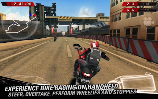
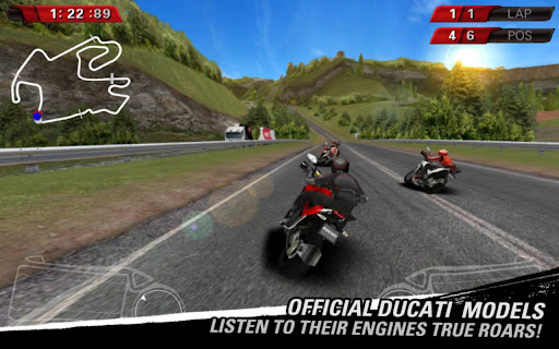
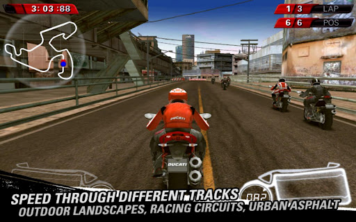
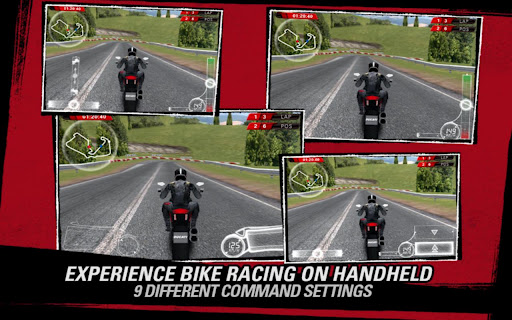
Ducati Challenge v1.02
Ducati Challenge v1.02

Speed and fun on two wheels, in the palm of your hand.
DOWNLOAD DUCATI CHALLENGE NOW AND TAKE ADVANTAGE OF OUR LIMITED-TIME OFFER!!!
TO CELEBRATE THE ANDROID LAUNCH, DIGITAL TALES WILL REWARD EARLY ADOPTERS WITH 3000 BONUS COINS TO GET A HEAD START IN CHAMPIONSHIP MODE, PLUS ALL THE TRACKS AND BIKE MODELS UNLOCKED IN QUICK CHALLENGE MODE!
Speed and fun on two wheels, in the palm of your hand.
Get ready for breathtaking challenges and unique thrills riding official Ducati motorbikes in a graphically stunning 3D racing game. Wheelies, stoppies, overtaking, high speed and steering precision make Ducati Challenge a must-have game for Ducati and motorbike fans alike.
Official Ducati bikes
Ride the most powerful standard models in Ducati’s line, including Monster 1100 EVO, Hypermotard 1100 EVO SP, Diavel Carbon, Multistrada 1200 S, Streetfighter S, Superbike 1198 SP, Multistrada Pikes Peak, Diavel Cromo and Superbike 1199 Panigale S. The roar of every single engine was recorded live to offer all Ducati fans an immersive experience.
Original and varied tracks
Fast race tracks, winding mountain roads, narrow medieval village streets, bustling metropolises and hot desert valleys will make the perfect locations for exciting challenges, where you can safely unleash all the power of Ducati’s awesome bikes.
CHAMPIONSHIP MODE
Tackle a series of challenges to become Champion. Earn points during races, unlock new goodies and circuits in Quick Challenge mode. Upgrade your bikes and crush your opponents. Use enhanced fuel to improve your performance.
QUICK CHALLENGE MODE
Pick your ride, track, number of laps and difficulty level and just jump into the race. More tracks and bikes will be unlocked as you progress through the championship mode.
Different camera angles
In-game camera angles convey all the thrills of high speed racing on two wheels. Opt for a standard third person view or the amazing first person view.
Easy handling
Thanks to the customizable handling system (including steering sensitivity control based on your device leaning and the brake assist), Ducati Challenge offers user-friendly controls for players of all levels, ranging from beginners to experts.
You can choose between arcade and simulation settings to get your favourite driving experience.
Graphic Quality
Thanks to the graphic quality customization, you can choose between 3 different settings to get the best performance out of your device: low quality (no effects), medium quality (anti-aliasing activated), high quality (anti-aliasing + motion blur + high quality particles activated).
Image galleries and achievements
The rich game Extras, including unlockable achievements and exclusive Ducati images you can save on your device, will be the icing on the cake for all Ducati fans.
Required Android O/S : 2.3+
https://play.google.com/store/apps/details?id=it.dtales.DucatiChallengeFree
sd data Android/data)
BlindNinja

Become a hero BlindNinja Sing!
You must be a Ninja.
Just do it now!!!
We hope that this game will give you extra-life happiness.


A beautiful graphics that are a scene that reminds of
a fairy tale unfolded before your eyes.
Features:
Easy to learn the difficult to master!
Run run run! Jump jump jump! Hit hit hit!
Kill scarecrow you can create numerous combos!
Beautifully detailed backgrounds!
Required Android O/S : 2.2+
https://play.google.com/store/apps/details?id=com.EggBones.BlindNinja
